require(igraph)
g <- make_graph( c(1,2, 1,3, 2,3, 2,4, 3,5, 4,5), n=5, dir=FALSE )
plot(g, vertex.color="skyblue2")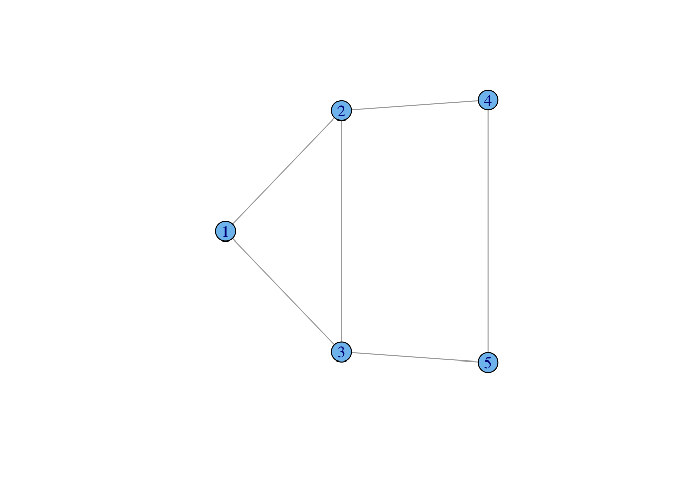
A graph is simply a collection of vertices (or nodes) and edges (or ties).
We can denote this \(\mathcal{G}(V,E)\), where \(V\) is a the vertex set and \(E\) is the edge set.
The vertices of the graph represent the actors in the social system. These are usually individual people, but they could be households, geographical localities, institutions, or other social entities.
The edges of the graph represent the relations between these entities (e.g., “is friends with” or “has sexual intercourse with” or “sends money to”). These edges can be directed (e.g., “sends money to”) or undirected (e.g., “within 2 meters of”).
When the relations that define the graph are directional, we have a directed graph or digraph.
Graphs (and digraphs) can be binary (i.e., presence/absence of a relationship) or valued (e.g., “groomed five times in the observation period”, “sent $100”).
A graph (with no self-loops) with \(n\) vertices has \({n \choose 2} = n(n-1)/2\) possible unordered pairs. This number (which can get very big!) is important for defining the density of a graph, i.e., the fraction of all possible relations that actually exist in a network.
Collection of vertices (or nodes) and undirected edges (or ties), denoted \(\mathcal{G}(V,E)\), where \(V\) is a the vertex set and \(E\) is the edge set.
Collection of vertices (or nodes) and directed edges.
Graph where all the nodes of a graph can be partitioned into two sets \(\mathcal{V}_1\) and \(\mathcal{V}_2\) such that for all edges in the graph connects and unordered pair where one vertex comes from \(\mathcal{V}_1\) and the other from \(\mathcal{V}_2\). Often called an “affiliation graph” as bipartite graphs are used to represent people’s affiliations to organizations or events.
igraph is a package that provides tools for the analysis and visualization of networks
Create a small, undirected graph of five vertices from a vector of vertex pairs
require(igraph)
g <- make_graph( c(1,2, 1,3, 2,3, 2,4, 3,5, 4,5), n=5, dir=FALSE )
plot(g, vertex.color="skyblue2")
Create a small graph using graph_from_literal()
Undirected edges are indicated with one or more dashes -, --, etc. It doesn’t matter how many dashes you use – you can use as many as you want to make your code more readable.
The colon operator : links “vertex sets” – i.e., creates ties between all members of two groups of vertices
g <- graph_from_literal(Fred:Daphne:Velma:Shaggy-Fred:Daphne:Velma:Shaggy, Shaggy-Scooby)
plot(g, vertex.shape="none", vertex.label.color="black")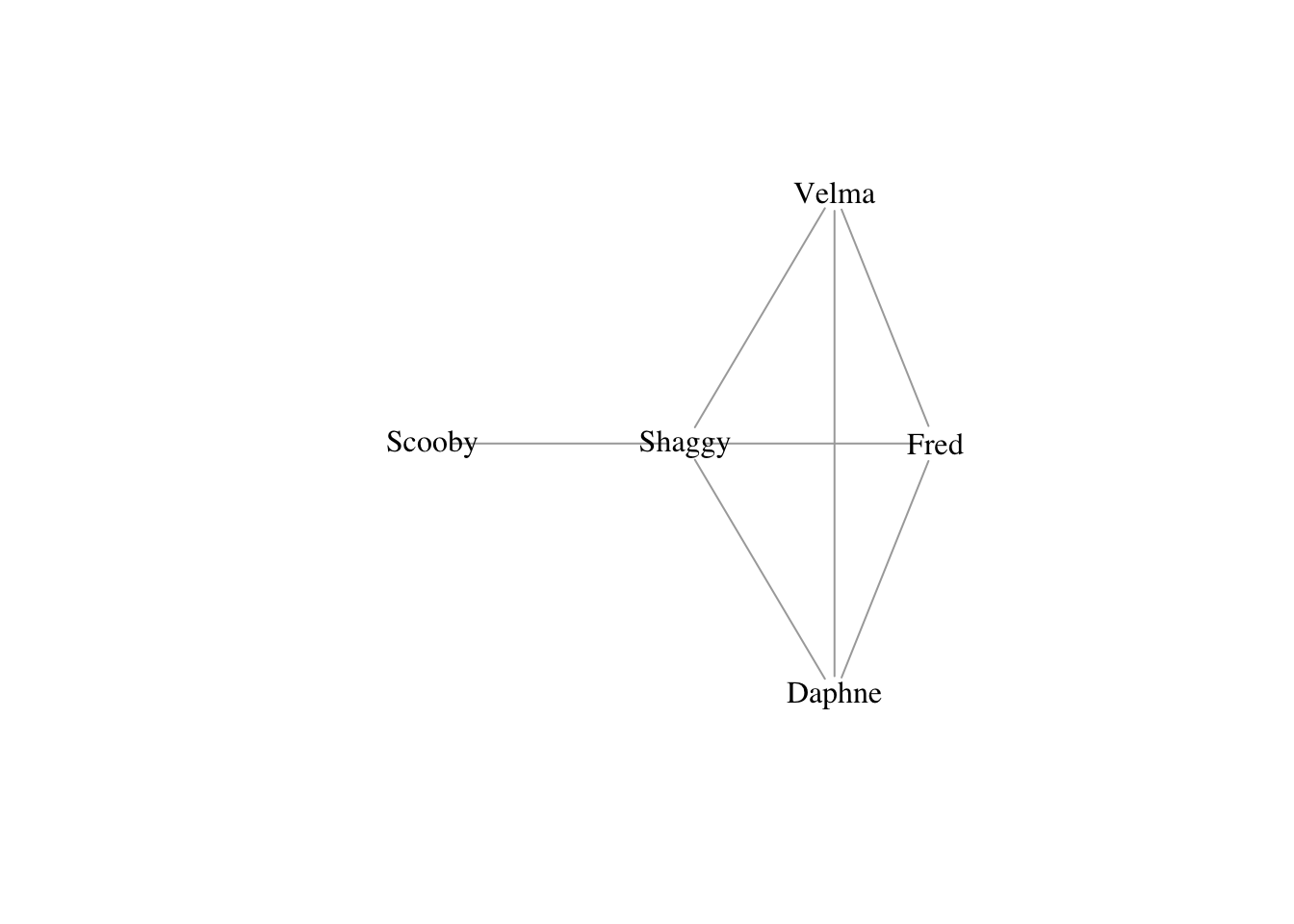
Make directed edges using -+ where the plus indicates the direction of the arrow, i.e., A --+ B creates a directed edge from A to B
A mutual edge can be created using +-+
knit the RMarkdown document, R generates fairly small .png files. If you have, for example, vertex labels that really need to read, it is a good idea to send your plot to a file that uses a vector-based format and potentially make it big. My preference is .pdf, but an argument can be made that .svg is even better. To do this, you just need to wrap your plotting commands in call to .pdf: pdf(file="filename.pdf", height14, width=14) and then don’t forget to close this off (i.e., after all your plotting commands) with dev.off() or you’ll keep sending graphics to your pdf file! The default size for pdf is \(7 \times 7\) (in inches). By specifying the optional arguments height and width, we’ve doubled the size of the plot. This will spread things out quite a bit and you may actually have to increase the size of your vertices, labels, etc.# empty graph
g0 <- make_empty_graph(20)
plot(g0, vertex.color="skyblue2", vertex.size=10, vertex.label=NA,
layout=layout_in_circle(g0))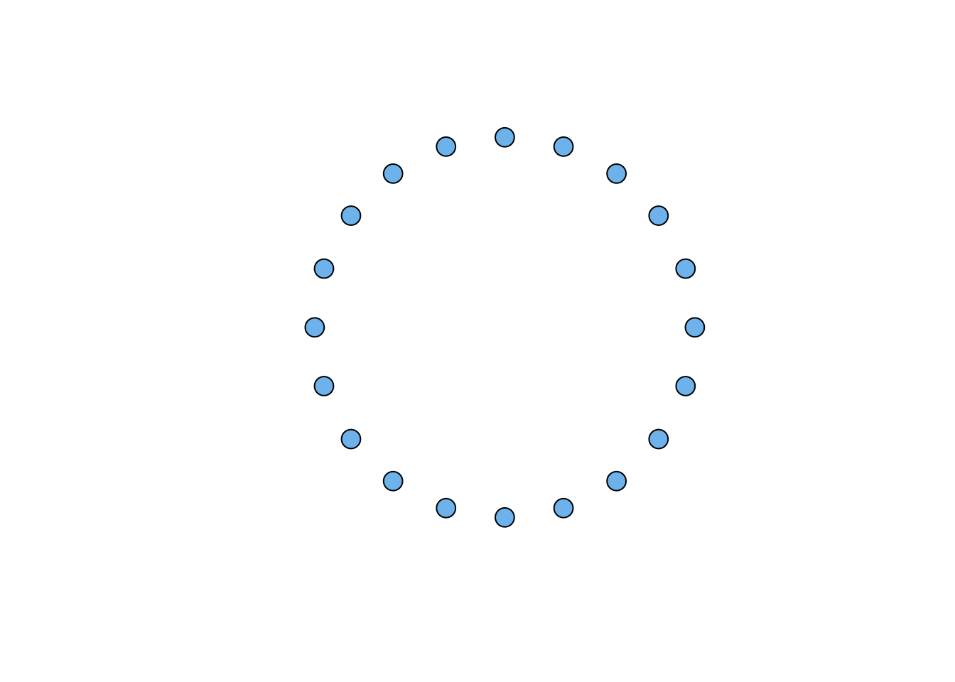
# full graph
g1 <- make_full_graph(20)
plot(g1, vertex.color="skyblue2", vertex.size=10, vertex.label=NA)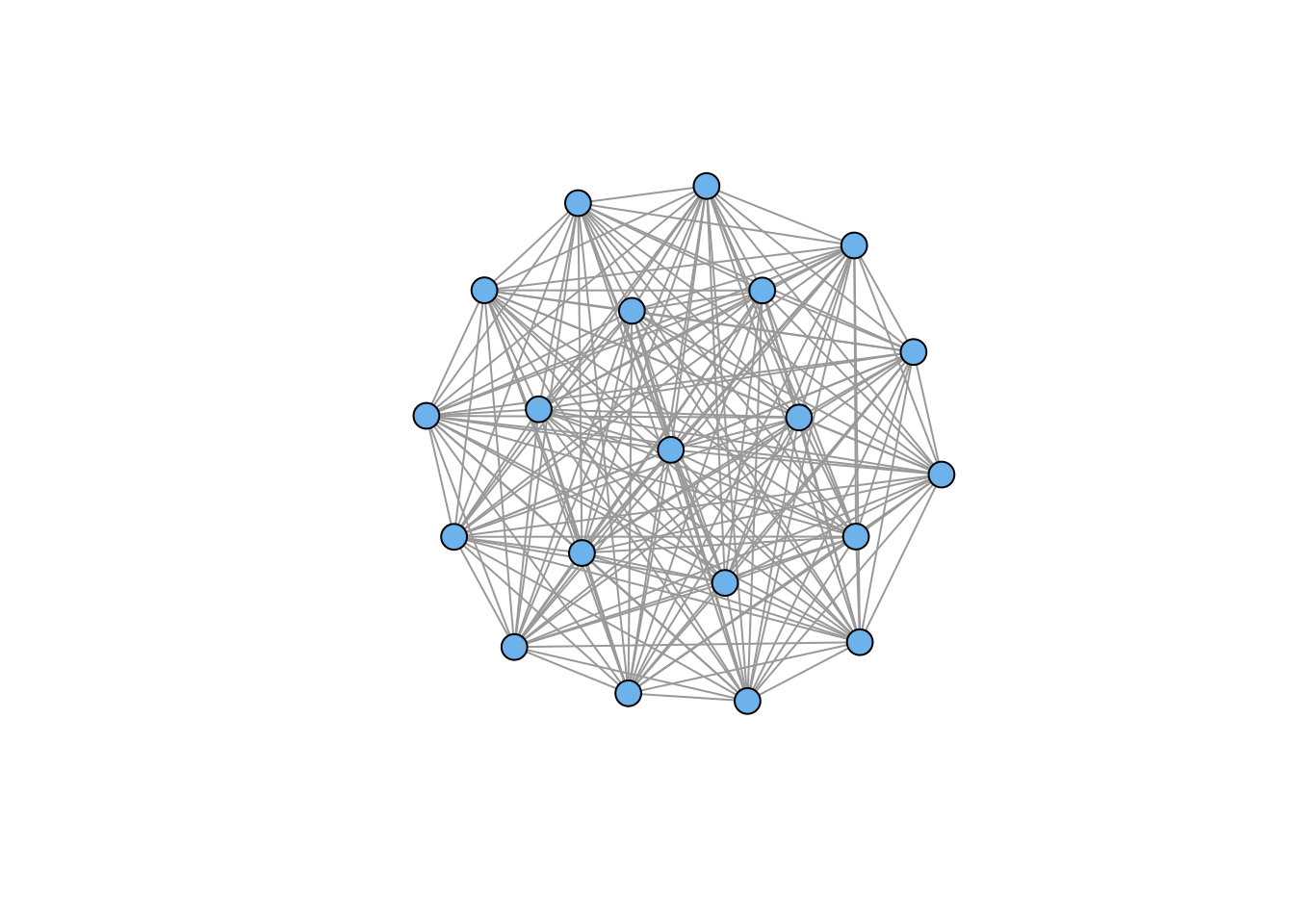
# ring
g2 <- make_ring(20)
plot(g2, vertex.color="skyblue2", vertex.size=10, vertex.label=NA)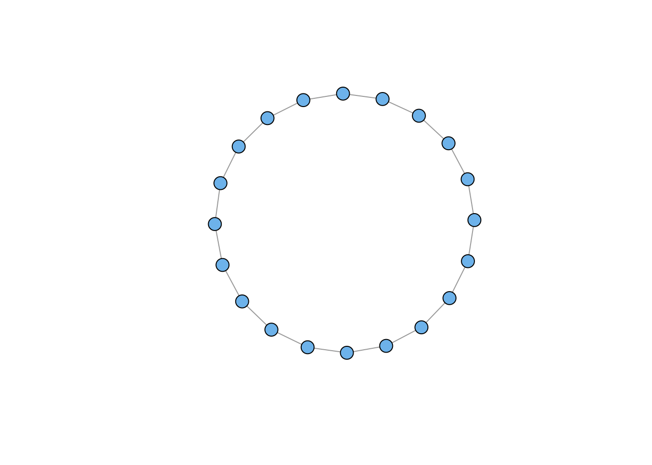
igraph has clearly changed the defaults for plotting an empty graph, so I added an explicit layout command to render the nodes on a circle.
# lattice
g3 <- make_lattice(dimvector=c(10,10))
plot(g3, vertex.color="skyblue2", vertex.size=10, vertex.label=NA)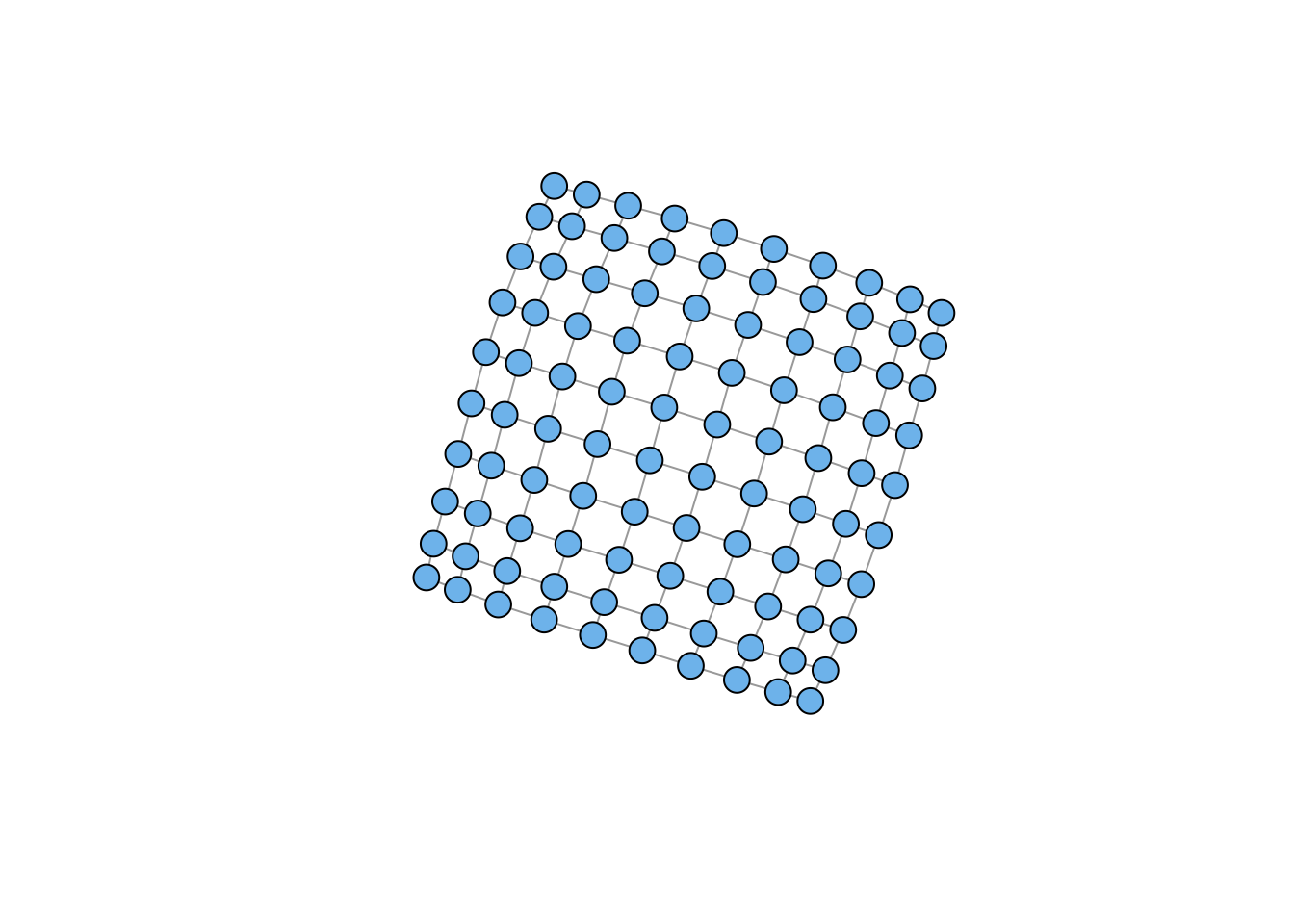
# tree
g4 <- make_tree(20, children = 3, mode = "undirected")
plot(g4, vertex.color="skyblue2", vertex.size=10, vertex.label=NA)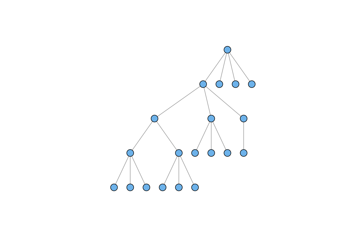
# star
g5 <- make_star(20, mode="undirected")
plot(g5, vertex.color="skyblue2", vertex.size=10, vertex.label=NA,
     layout=layout_as_star(g5))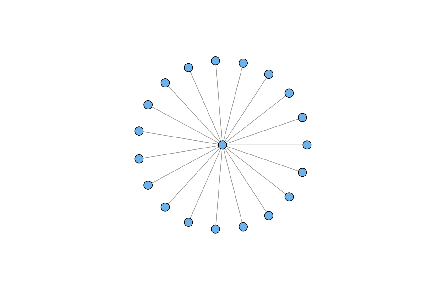
You’ll notice the lattice looks a bit funky. We’ll take this up later on. The star graph also raises some issues. This is another case where the igraph defaults have changed in weird ways. Plotting the star apparently defaults to placing the hub at the top with all the spokes below. I used an explicit call to layout_as_star to try to get something like the previous default. Worked fine; just more arguments.
# Erdos-Renyi Random Graph
g6 <- sample_gnm(n=100,m=50)
plot(g6, vertex.color="skyblue2", vertex.size=5, vertex.label=NA)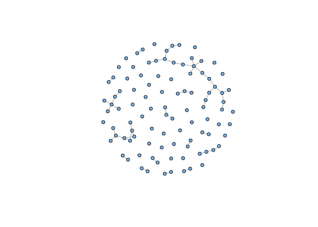
# Power Law
g7 <- sample_pa(n=100, power=1.5, m=1,  directed=FALSE)
plot(g7, vertex.color="skyblue2", vertex.size=5, vertex.label=NA)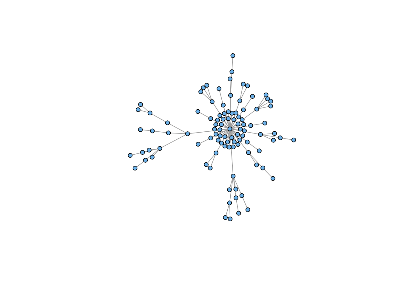
Sometimes you want to plot two (or more) graphs together
The disjoint union operator allows you to merge two graphs with different vertex sets
plot(g4 %du% g7, vertex.color="skyblue2", vertex.size=5, vertex.label=NA)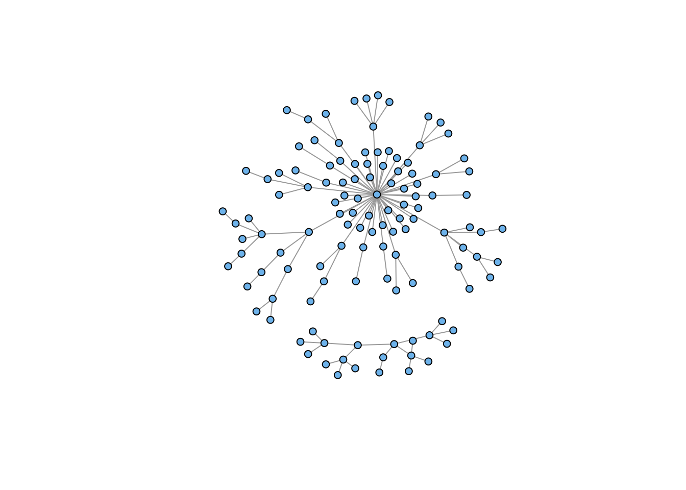
Note that the disjoint union creates a single graph with two disconnected components (i.e., the two previous graphs).
We often want to rewire graphs, for example, if we are simulating edge dynamics. We can also use edge rewiring to (hopefully) connect disconnected components, as above. This can work, but it’s important to note that rewiring can just as easily disconnect as it can connect, particularly if the graph is relatively sparse.
gg <- g4 %du% g7
gg <- rewire(gg, each_edge(prob = 0.3))
plot(gg, vertex.color="skyblue2", vertex.size=5, vertex.label=NA)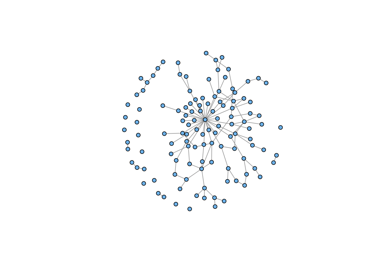
## retain only the connected component
gg <- induced_subgraph(gg, subcomponent(gg,1))
plot(gg, vertex.color="skyblue2", vertex.size=5, vertex.label=NA)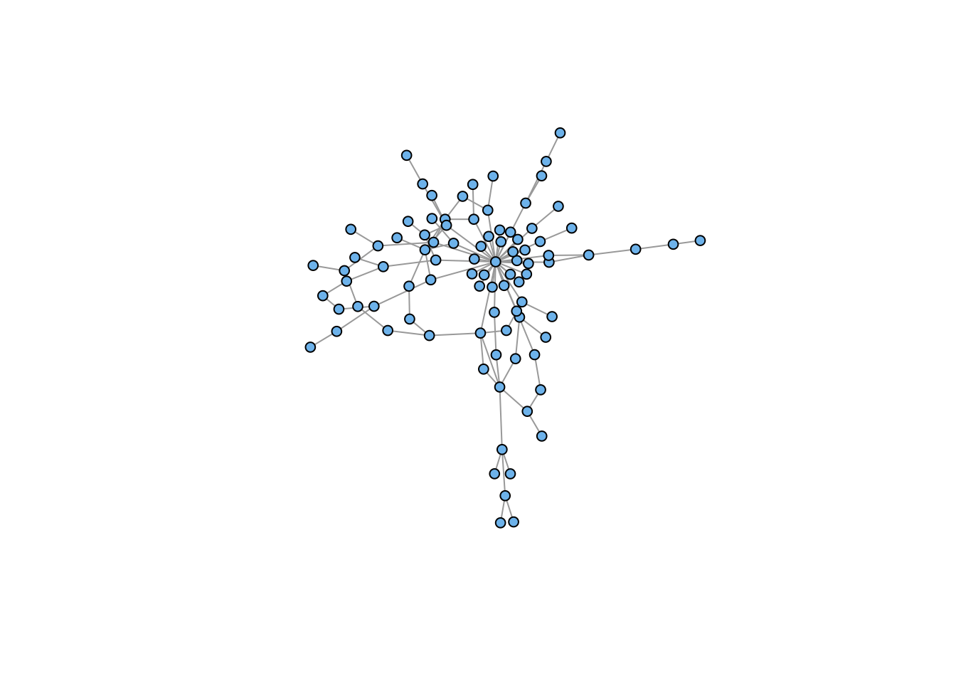
Here, our rewiring led to the creation of a fairly large number of isolates, which we suppress in the second plot.
You can add arbitrary attributes to both vertices and edges. Generally, you do this to store information for plotting: colors, edge weights, names, etc.
Some attributes are automatically created when you construct an graph object (e.g., “name” or “weight” if you load a weighted adjacency matrix)
V(g) accesses vertex attributes
E(g) accesses edge attributes
## look at the structure
g4
IGRAPH 8768944 U--- 20 19 -- Tree
+ attr: name (g/c), children (g/n), mode (g/c)
+ edges from 8768944:
[1] 1-- 2 1-- 3 1-- 4 2-- 5 2-- 6 2-- 7 3-- 8 3-- 9 3--10 4--11 4--12 4--13
[13] 5--14 5--15 5--16 6--17 6--18 6--19 7--20V(g4)$name <- LETTERS[1:20]
## see how it's changed
g4IGRAPH 8768944 UN-- 20 19 -- Tree
+ attr: name (g/c), children (g/n), mode (g/c), name (v/c)
+ edges from 8768944 (vertex names):
[1] A--B A--C A--D B--E B--F B--G C--H C--I C--J D--K D--L D--M E--N E--O E--P
[16] F--Q F--R F--S G--T## see what I did there?
## hexadecimal color codes
V(g4)$vertex.color <- "#4503fc"
E(g4)$edge.color <- "#abed8e"
g4IGRAPH 8768944 UN-- 20 19 -- Tree
+ attr: name (g/c), children (g/n), mode (g/c), name (v/c),
| vertex.color (v/c), edge.color (e/c)
+ edges from 8768944 (vertex names):
[1] A--B A--C A--D B--E B--F B--G C--H C--I C--J D--K D--L D--M E--N E--O E--P
[16] F--Q F--R F--S G--Tplot(g4, vertex.size=15, vertex.label=NA, vertex.color=V(g4)$vertex.color,
vertex.frame.color=V(g4)$vertex.color,
edge.color=E(g4)$edge.color, edge.width=3)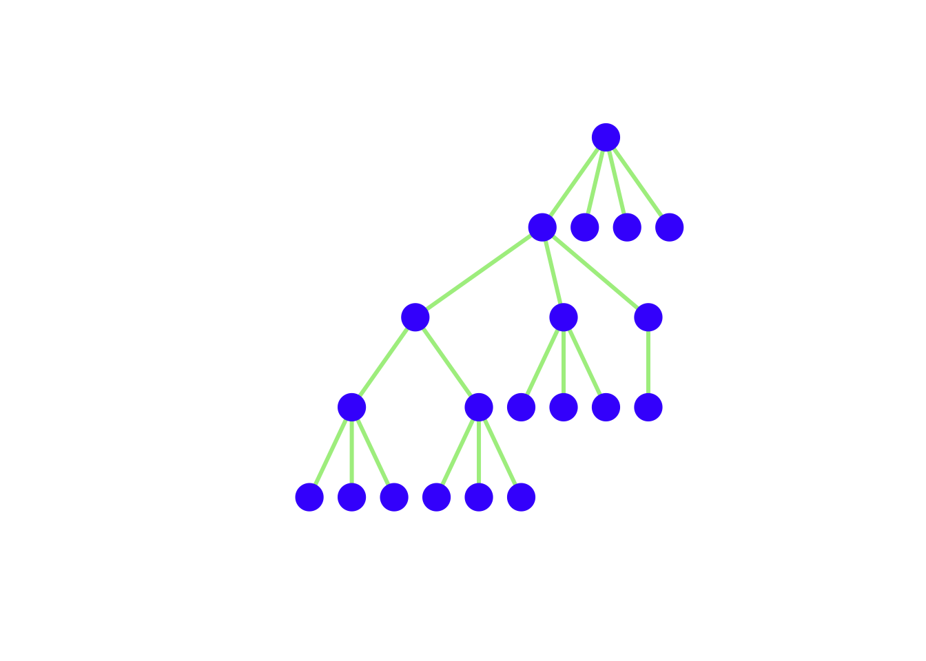
Most primatologists/behavioral ecologists probably have experience thinking in terms of adjacency matrices
An example of an adjacency matrix is the pairwise interaction matrices (e.g., agonistic or affiliative interactions) that we construct from behavioral observations
A very important potential gotcha: when you read data into R, it will be in the form of a data frame. Converting an adjacency matrix to an igraph graph object requires the data to be in the matrix class. Therefore, you need to coerce the data you read in by wrapping your read.table() in an as.matrix() command.
kids <- as.matrix(
  read.table("data/strayer_strayer1976-fig2.txt",
                             header=FALSE)
  )
kid.names <- c("Ro","Ss","Br","If","Td","Sd","Pe","Ir","Cs","Ka",
                "Ch","Ty","Gl","Sa", "Me","Ju","Sh")
colnames(kids) <- kid.names
rownames(kids) <- kid.names
g <- graph_from_adjacency_matrix(kids, mode="directed", weighted=TRUE)
lay <- layout_with_fr(g)
plot(g, layout=lay, edge.arrow.size=0.5,
     vertex.color="skyblue2", vertex.label.family="Helvetica",
     vertex.frame.color="skyblue2")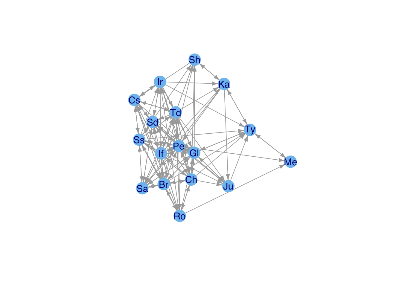
Note that you might want to change some of the graphics parameters depending on the type of display you use. For this document, the figures are constrained to be small .png files, so you don’t want edges – and particularly arrows – to be too thick.
Adjacency matrices are actually very inefficient
Most sociomatrices are quite sparse
Cost of an adjacency matrix increases as \(k^2\)
Edge Lists are much more efficient
An edge list is essentially a sparse-matrix representation of the sociomatrix
Various algorithms for detecting clusters of similar vertices – i.e., “communities”
Use cluster_fast_greedy() to identify clusters in Kapferer’s tailor shop and color the vertices based on their membership
cluster_fast_greedy() identifies four clusters
These clusters are listed as numbers in fg$membership
Use this vector to index vertex colors
A <- as.matrix(
  read.table(file="data/kapferer-tailorshop1.txt",
             header=TRUE, row.names=1)
  )
G <-  graph_from_adjacency_matrix(A, mode="undirected", diag=FALSE)
fg <- cluster_fast_greedy(G)
cols <- c("blue","red","black","magenta")
plot(G, vertex.shape="none",
     vertex.label.cex=0.75, edge.color=grey(0.85),
     edge.width=1, vertex.label.color=cols[fg$membership],
     vertex.label.family="Helvetica")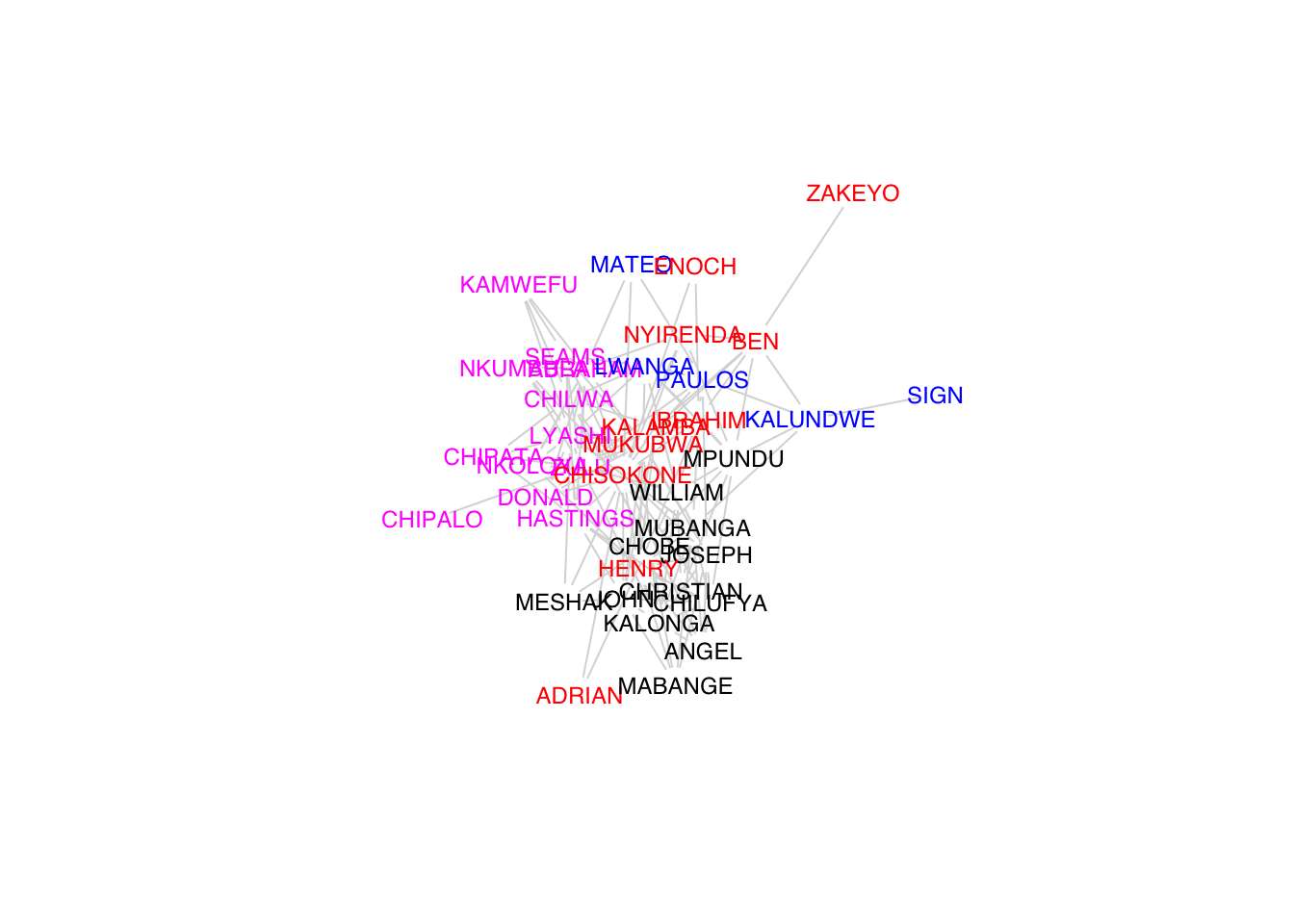
# another approach to visualizing
plot(fg,G,vertex.label=NA)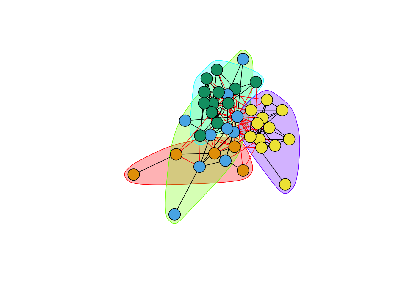
The layout is of any given plot is random (e.g., plot the same graph repeatedly and you’ll see that the layout changes with each plot)
igraph provides a tool for tinkering with the layout called tkplot()
Call tkplot() and it will open an X11 window (on Macs at least)
Select and drag the vertices into the layout you want, then use tkplot.getcoords(gid) to get the coordinates (where gid is the graph id returned when calling tkplot() on your graph)
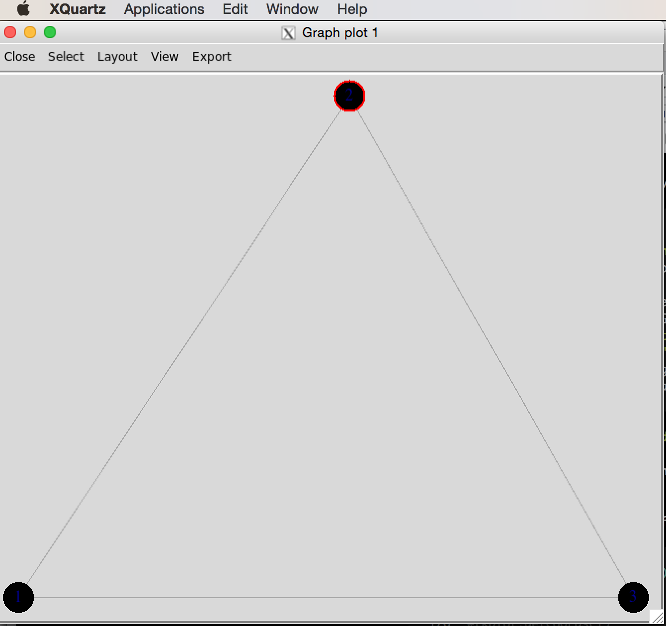
tkplot() window of triangle graphg <- graph( c(1,2, 2,3, 1,3), n=3, dir=FALSE)Warning: `graph()` was deprecated in igraph 2.1.0.
ℹ Please use `make_graph()` instead.plot(g,
vertex.color="skyblue2",
vertex.frame.color="skyblue2", vertex.label.family="Helvetica")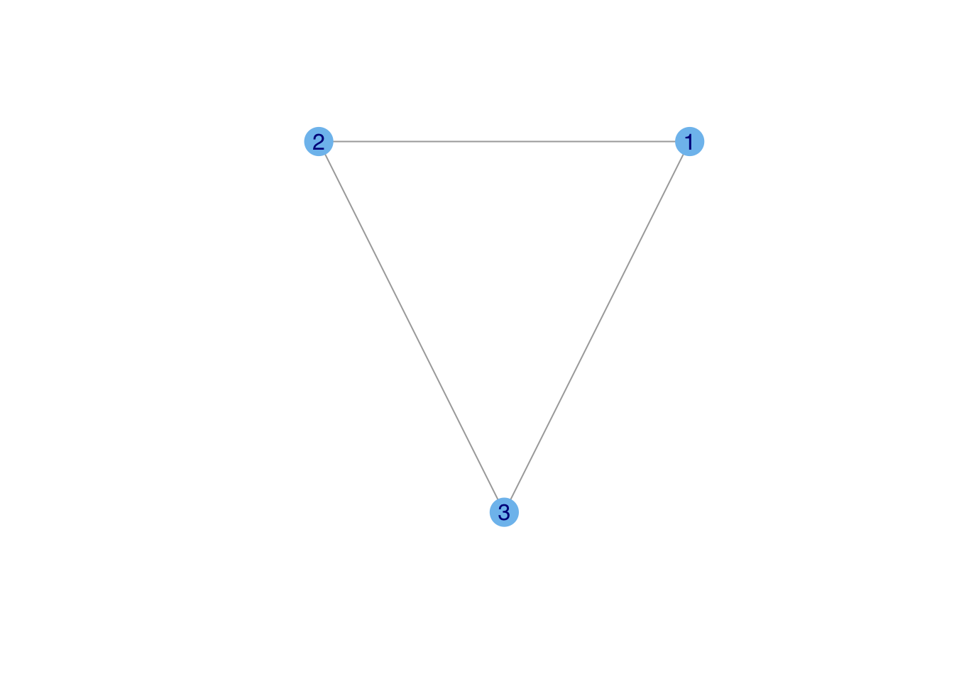
#tkplot(g)
#tkplot.getcoords(1)
### do some stuff with tkplot() and get coords which we call tri.coords
## tkplot(g)
## tkplot.getcoords(1) ## the plot id may be different depending on how many times you've called tkplot()
## [,1] [,2]
##[1,] 228 416
##[2,] 436 0
##[3,] 20 0
tri.coords <- matrix( c(228,416, 436,0, 20,0), nr=3, nc=2, byrow=TRUE)
par(mfrow=c(1,2))
plot(g,
     vertex.color="skyblue2",
     vertex.frame.color="skyblue2", vertex.label.family="Helvetica")
plot(g, layout=tri.coords,
vertex.color="skyblue2",
vertex.frame.color="skyblue2", vertex.label.family="Helvetica")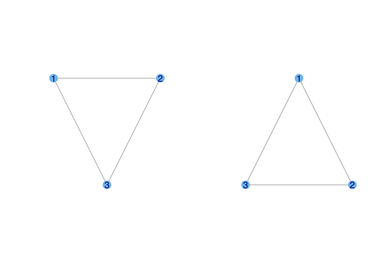
This is another interesting change in igraph defaults. In previous iterations of these notes, the first triangle would be laid out in some random orientation. Now, it seems to default to something more pleasing to human eyes. Note, however, that while the triangle is laid out such that its base is horizontal, the orientation of the vertices is still random. Probably most people would choose to put vertex one on top and then add two and three in either clockwise (as in the second triangle) or counter-clockwise fashion.
You may have noticed that the lattice we plotted when we introduced make_lattice() was a bit funky. This is because for a force-based layout, vertices on the periphery will have very different forces working on them than those in the center.
To get a proper lattice layout, specify that you want it on a grid
plot(g3, vertex.color="skyblue2",
     layout=layout_on_grid(g3,10,10), vertex.size=10, vertex.label=NA)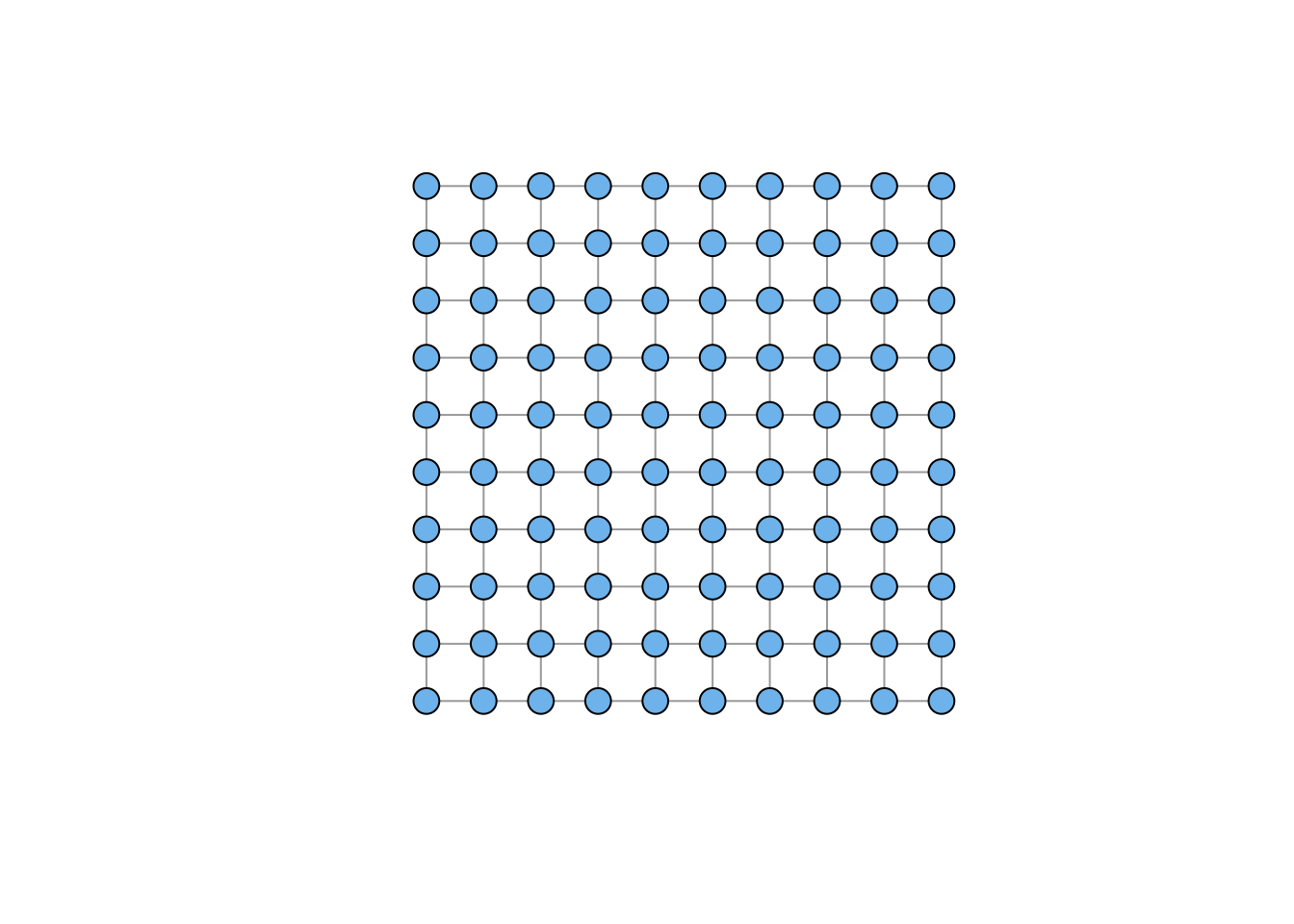
Affiliation graphs are a very important format. An affiliation graph is bipartite, meaning that connections can happen between two different types of vertices, but not within these types. The classic example of the Davis Southern Women data associates individual women with different parties. The people (the first vertex class) are affiliated with the parties (the second vertex class). Hence the name affiliation graph. There are lots of examples of affiliation or bipartite graphs: a strictly heterosexual sexual network, networks of pollinators and plants, networks of authors and papers, board members and corporate-governance boards, etc.
Here is is the Davis Southern Women affiliation graph:
davismat <- as.matrix(
  read.table(file="data/davismat.txt",
            row.names=1, header=TRUE)
  )
southern <- graph_from_biadjacency_matrix(davismat)
V(southern)$shape <- c(rep("circle",18), rep("square",14))
V(southern)$color <- c(rep("blue",18), rep("red", 14))
plot(southern, layout=layout.bipartite)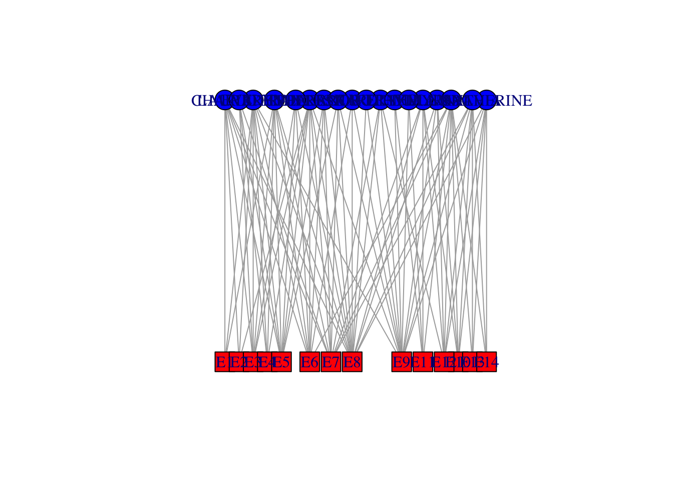
## not so beautiful
## did some tinkering using tkplot()...
x <- c(rep(23,18), rep(433,14))
y <- c(44.32432,   0.00000, 132.97297,  77.56757,  22.16216, 110.81081, 155.13514,
       199.45946, 177.29730, 243.78378, 332.43243, 410.00000, 387.83784, 354.59459,
       310.27027, 221.62162, 265.94595, 288.10811,   0.00000,  22.16216,  44.32432,
       66.48649,  88.64865, 132.97297, 166.21622, 199.45946, 277.02703, 365.67568,
       310.27027, 343.51351, 387.83784, 410.00000)
southern.layout <- cbind(x,y)
plot(southern, layout=southern.layout, vertex.label.family="Helvetica")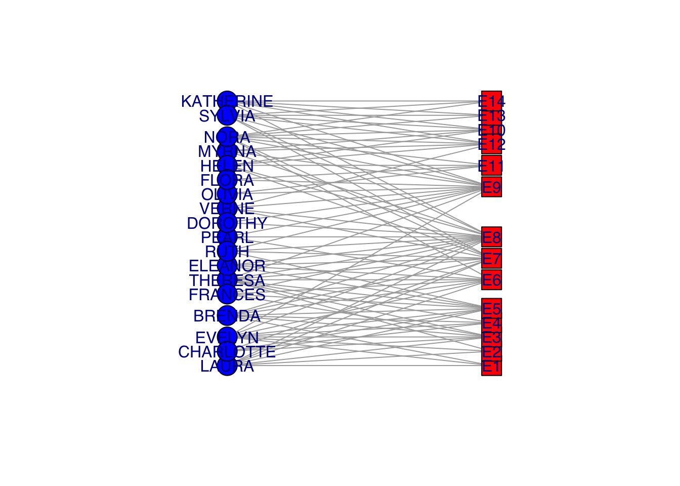
Visualization of bipartite graphs can be challenging. This is obviously not a great way to do it!
The incidence matrix is \(n \times k\), where \(n\) is the number of actors and \(k\) is the number of events
This is another instance of the changing igraph conventions. My older notes (and research code) use graph.incidence() to read incidence matrices. The correct command is now graph_from_biadjacency_matrix(), which is a bit more cumbersome.
Project the incidence matrix \(X\) into social space, creating a sociomatrix \(A\), \(\mathbf{A} = \mathbf{X}\, \mathbf{X}^T\)
Use the R inner-product operator %*% for matrix multiplication
Also note that t() is the matrix-transpose operator
This transforms the \(n \times k\) into an \(n \times n\) sociomatrix
#Sociomatrix
(f2f <- davismat %*% t(davismat))
EVELYN LAURA THERESA BRENDA CHARLOTTE FRANCES ELEANOR PEARL RUTH
EVELYN 8 6 7 6 3 4 3 3 3
LAURA 6 7 6 6 3 4 4 2 3
THERESA 7 6 8 6 4 4 4 3 4
BRENDA 6 6 6 7 4 4 4 2 3
CHARLOTTE 3 3 4 4 4 2 2 0 2
FRANCES 4 4 4 4 2 4 3 2 2
ELEANOR 3 4 4 4 2 3 4 2 3
PEARL 3 2 3 2 0 2 2 3 2
RUTH 3 3 4 3 2 2 3 2 4
VERNE 2 2 3 2 1 1 2 2 3
MYRNA 2 1 2 1 0 1 1 2 2
KATHERINE 2 1 2 1 0 1 1 2 2
SYLVIA 2 2 3 2 1 1 2 2 3
NORA 2 2 3 2 1 1 2 2 2
HELEN 1 2 2 2 1 1 2 1 2
DOROTHY 2 1 2 1 0 1 1 2 2
OLIVIA 1 0 1 0 0 0 0 1 1
FLORA 1 0 1 0 0 0 0 1 1
VERNE MYRNA KATHERINE SYLVIA NORA HELEN DOROTHY OLIVIA FLORA
EVELYN 2 2 2 2 2 1 2 1 1
LAURA 2 1 1 2 2 2 1 0 0
THERESA 3 2 2 3 3 2 2 1 1
BRENDA 2 1 1 2 2 2 1 0 0
CHARLOTTE 1 0 0 1 1 1 0 0 0
FRANCES 1 1 1 1 1 1 1 0 0
ELEANOR 2 1 1 2 2 2 1 0 0
PEARL 2 2 2 2 2 1 2 1 1
RUTH 3 2 2 3 2 2 2 1 1
VERNE 4 3 3 4 3 3 2 1 1
MYRNA 3 4 4 4 3 3 2 1 1
KATHERINE 3 4 6 6 5 3 2 1 1
SYLVIA 4 4 6 7 6 4 2 1 1
NORA 3 3 5 6 8 4 1 2 2
HELEN 3 3 3 4 4 5 1 1 1
DOROTHY 2 2 2 2 1 1 2 1 1
OLIVIA 1 1 1 1 2 1 1 2 2
FLORA 1 1 1 1 2 1 1 2 2gf2f <- graph_from_adjacency_matrix(f2f, mode="undirected", diag=FALSE)
gf2f <- simplify(gf2f)
plot(gf2f, vertex.color="skyblue2",vertex.label.family="Helvetica")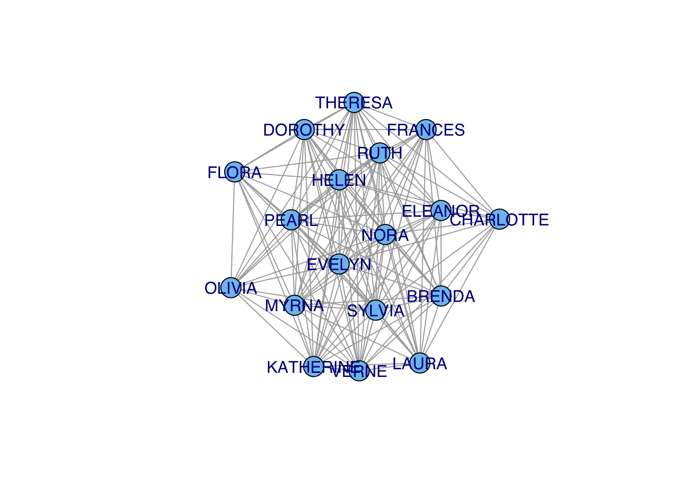
## who is the most central?
cb <- betweenness(gf2f)
#plot(gf2f,vertex.size=cb*10, vertex.color="skyblue2")
plot(gf2f,vertex.label.cex=1+cb/2, vertex.shape="none",vertex.label.family="Helvetica")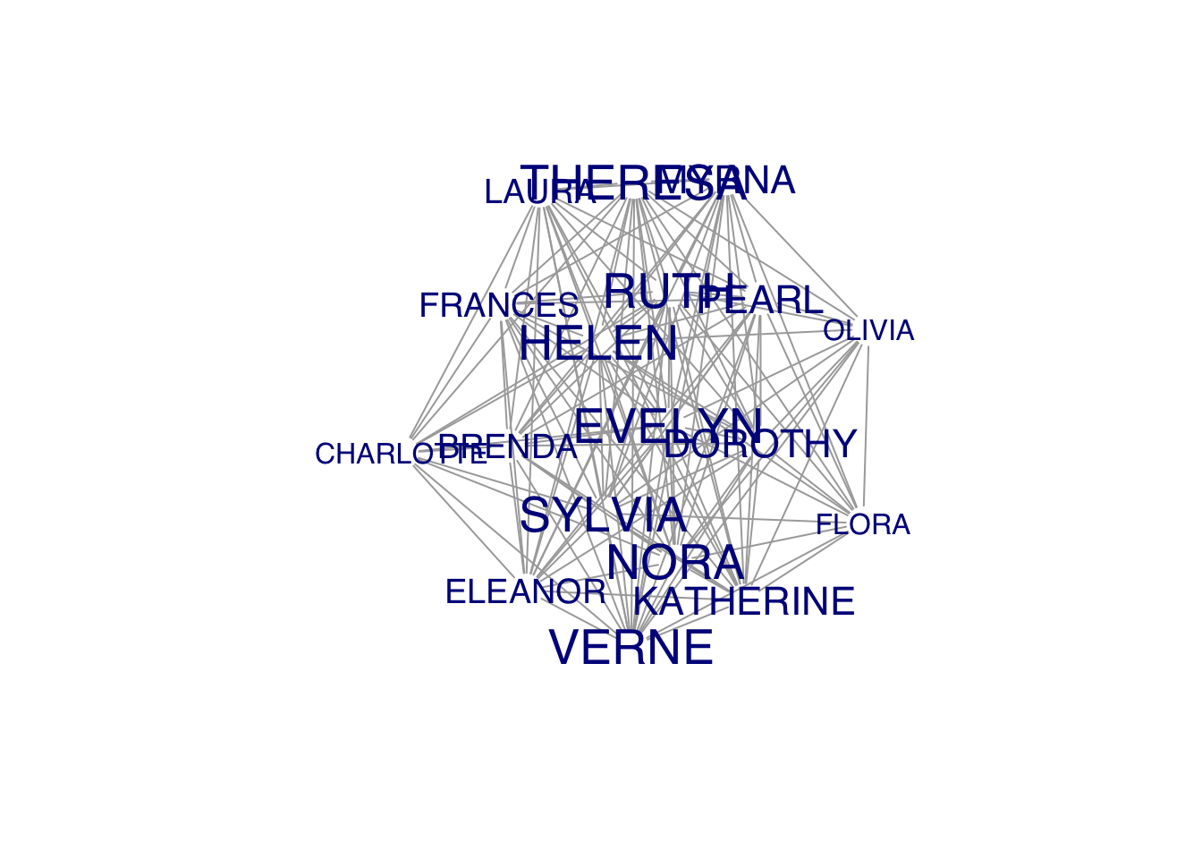
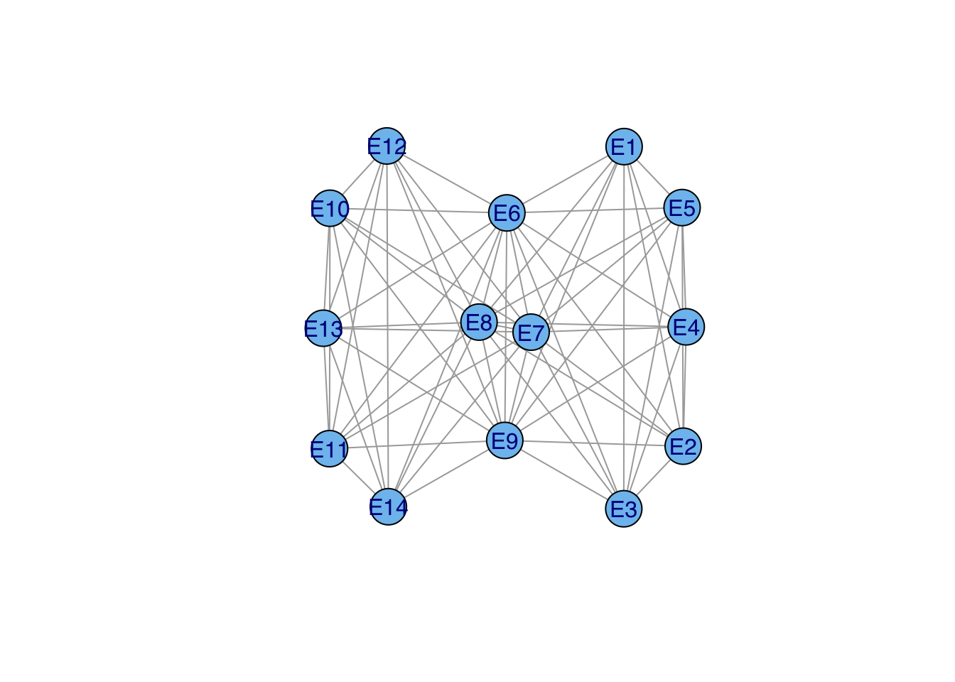
### this gives you the number of women at each event (diagonal) or mutually at 2 events
(e2e <- t(davismat) %*% davismat)
E1 E2 E3 E4 E5 E6 E7 E8 E9 E10 E11 E12 E13 E14
E1 3 2 3 2 3 3 2 3 1 0 0 0 0 0
E2 2 3 3 2 3 3 2 3 2 0 0 0 0 0
E3 3 3 6 4 6 5 4 5 2 0 0 0 0 0
E4 2 2 4 4 4 3 3 3 2 0 0 0 0 0
E5 3 3 6 4 8 6 6 7 3 0 0 0 0 0
E6 3 3 5 3 6 8 5 7 4 1 1 1 1 1
E7 2 2 4 3 6 5 10 8 5 3 2 4 2 2
E8 3 3 5 3 7 7 8 14 9 4 1 5 2 2
E9 1 2 2 2 3 4 5 9 12 4 3 5 3 3
E10 0 0 0 0 0 1 3 4 4 5 2 5 3 3
E11 0 0 0 0 0 1 2 1 3 2 4 2 1 1
E12 0 0 0 0 0 1 4 5 5 5 2 6 3 3
E13 0 0 0 0 0 1 2 2 3 3 1 3 3 3
E14 0 0 0 0 0 1 2 2 3 3 1 3 3 3ge2e <- graph_from_adjacency_matrix(e2e, mode="undirected", diag=FALSE)
ge2e <- simplify(ge2e)
plot(ge2e, vertex.size=20, vertex.color="skyblue2",vertex.label.family="Helvetica")