2  Ecology

2.1 Lotka-Volterra

require(deSolve)
## classic Lotka Volterra
lv <- function(t, x, parms) {
  with(as.list(parms), {
    dx1 <- r1*x[1] - c1*x[1]*x[2]
    dx2 <- -r2*x[2] + c2*x[1]*x[2]
    results <- c(dx1,dx2)
    list(results)
  })
}

xstart <- c(x1=10,x2=1)
times <- seq(0,300,length=1001)
parms <- c(r1=0.2, r2=0.1, c1=0.2, c2=0.05)
out1 <- as.data.frame(ode(xstart,times,lv,parms))
colnames(out1) <- c("times","prey","predator")

plot(out1[,"times"], out1[,"prey"], type="l", lwd=2, col="blue", 
     xlab="Time", ylab="Population Size")
lines(out1[,"times"], out1[,"predator"], lwd=2, col="red")

plot(out1[,"prey"], out1[,"predator"], type="l", lwd=2, col="magenta", 
     xlab="Prey Population Size", ylab="Predator Population Size")

2.2 Surprisingly Complex Dynamics from Simple Models

Recreate the plots from May (1976).

# re-create figures in May (1976)

# logistic map
lmap <- expression(a*x*(1-x))

## make x bound on [0,1] to avoid pathological behavior of negative pop size
x <- seq(0,1,length=1000)

### first plot the unstable recruitment curve
a <- 3.414
x1 <- eval(lmap)
plot(x,x1, type="l", lwd=2,
     xlab=expression(X[t]),ylab=expression(X[t+1]))

## equilibrium for logistic map
xstar1 <- 1-(1/a)

## numerical derivative
x1p <- diff(x1)
xp <- diff(x)
### the equilibrium x is approximately x[706]
m1 <- x1p[706]/xp[706]

### use point-slope eq for a line y - y_1 = m(x - x_1)
### we know the point (xstar,xstar) so solve for eq we can use to draw line
lines(x[550:850], m1*x[550:850]-m1*xstar1+xstar1,lty=2)

### now plot the stable recruitment curve
## lower growth rate means shallower slope at equilibrium
a <- 2.707
x2 <- eval(lmap)
lines(x,x2, lwd=2, col=grey(0.75))
xstar2 <- 1-(1/a)
x2p <- diff(x2)
xp <- diff(x)
### the equilibrium x is approximately x[700]
m2 <- x2p[630]/xp[630]
lines(x[480:780], m2*x[480:780]-m2*xstar2+xstar2,lty=2)
abline(a=0,b=1)

## equilibrium where X_{t+1} = X_t
lines(x,x)

The figures are clearly mislabeled in May (1976)

## corrected figure 2
lmap2 <- expression(a*(a*x*(1-x))*(1-(a*x*(1-x))))


x2 <- eval(lmap2)
plot(x,x2,type="l",xlab=expression(X[t]), lwd=2,
     ylab=expression(X[t+2]), ylim=c(0,0.8))
lines(x[480:780], m2^2*x[480:780]-m2^2*xstar2+xstar2,lty=2)
lines(x,x)

## this is what figure 3 should be
a <- 3.414
plot(x,eval(lmap2),type="l",lwd=2,
     xlab=expression(X[t]),ylab=expression(X[t+2]))
lines(x[550:850], m1^2*x[550:850]-m1^2*xstar1+xstar1,lty=2)
lines(x,x)

In the first figure (\(a=2.707\)), there is only one non-zero equilibrium. The tangent at this equilibrium is shallow and the equilibrium is stable. As we move to a higher growth rate (\(a=3.414\)), a valley deepens between the two peaks and a second equilibrium appears. Note that the slope of the tangent at both these equiliria is quite steep, indicating instability.

Note that the valley between two peaks (even if it’s only shallow) isn’t a necessary consequence of plotting the second-order recursive map. If we use a growth rate, for example, more compatible with a human life cycle—albeit representing quite brisk growth—we get a qualitatively different plot. An intrinsic rate of increases of \(r=0.02\) translates into a value of \(a=1.65\).

## human (r=0.02, r=0.04 yields a=2.718282)
a <- 1.64872
xh <- eval(lmap2)
plot(x,xh, type="l", lwd=2,
     xlab=expression(X[t]),ylab=expression(X[t+1]))
lines(x,x)

No peaks/valley and ultra-stable equilibrium (slope of tangent near zero!).

Now we increase \(a\) further.

## chaotic region
a <- 3.571
plot(x,eval(lmap2),type="l", lwd=2,
     xlab=expression(X[t]),ylab=expression(X[t+2]))
lines(x,x)
a <- 3.414
lines(x,eval(lmap2), lwd=2, col=grey(0.75))

## human (r=0.02, r=0.04 yields a=2.718282)
a <- 1.64872
xh <- eval(lmap)
plot(x,xh, type="l", lwd=2,
     xlab=expression(X[t]),ylab=expression(X[t+1]))
lines(x,x)

xstarh <- 1-(1/a)
#[1] 0.3934689
xhp <- diff(xh)

### search for the point near the equlibrium
max(which(x<0.4))
[1] 400
x[394]
[1] 0.3933934
#[1] 0.3933934
mh <- xhp[393]/xp[393]
lines(x[300:500], mh*x[300:500]-mh*xstarh+xstarh,lty=2)
text(0.2,0.4, expression(paste(lambda, "=0.3532", sep="")))

## May (1976) Figure 5
lmap3 <- expression(a*(a*(a*x*(1-x))*(1-(a*x*(1-x))))*(1-(a*(a*x*(1-x))*(1-(a*x*(1-x))))))
a <- 3.7
x3 <- eval(lmap3)
plot(x,x3, type="l",lwd=2,
     xaxs="i", yaxs="i",
     xlim=c(0,1),
     ylim=c(0,1),
     xlab=expression(X[t]),ylab=expression(X[t+3]))
a <- 3.9
lines(x,eval(lmap3), lwd=2, col=grey(0.75))
lines(x,x)

Six equilibria.

As we keep cranking up the growth rate, the periods double, we can track how this happens by plotting the number of periods as a function of the growth rate.

n <- 1
R <- seq(2.5,4,length=1000)
f <- expression(a*x*(1-x))
data <- matrix(0,200,1001)

for(a in R){
  x <- runif(1) # random initial condition
  ## first converge to attractor
  for(i in 1:200){
    x <- eval(f)
  } # collect points on attractor
  for(i in 1:200){
    x <- eval(f)
    data[i,n] <- x
  }
  n <- n+1
}

data <- data[,1:1000]
plot(R,data[1,], pch=".", xlab="a", ylab="X")
for(i in 2:200) points(R,data[i,], pch=".")

Chaos!

This is all a prelude to the question that turns out to be essential for disease ecology.

2.2.1 Why Do Rodent Populations Cycle?

Rodents are common reservoirs for a variety of zoonoses. Yates et al. (2002) attribute the origin of Sin Nombre virus in the Desert Southwest, in part, to the high density of deer mice, Peromyscus maniculatus. High densities of rodents are implicated in Lyme disease, Babesiosis, Plague, Lassa fever, Leptospirosis, and others.

Using the insights of the last section, we can begin to see why rodent densities might cycle.

cole <- function(L,a,w,R,b,p)  p*(L^-1) + R*b*(L^-a) - R*b*(p^(w - a +1))*(L^-(w+1)) - 1

# mice, per month
uniroot(cole, lower=1, upper=5, extendInt="yes", 
        a=2.58, b=0.67, w=100, R=0.25, p=0.98)
$root
[1] 1.120025

$f.root
[1] 7.742e-06

$iter
[1] 5

$init.it
[1] NA

$estim.prec
[1] 6.103516e-05
## monthly growth rate
a <- uniroot(cole, lower=1, upper=5, extendInt="yes", 
             a=2.58, b=0.67, w=100, R=0.25, p=0.98)$root^12
### Dynamics
# logistic map
lmap <- function(a,x) a*x*(1-x)

## time series
x0 <- runif(1)
tmax <- 100
y <- rep(0,(tmax+1))
y[1] <- x0

for(t in 2:(tmax+1)) y[t] <- lmap(a=a,x=y[t-1])

plot(seq(0,tmax),y, type="l", xlab="Time", ylab="Population Size")

As we’ve seen in Section 2.2, when the growth rate is high enough—and popualtions are ultimately regulated by density—the the population will cycle erratically. If it’s really high, it will enter the chaotic domain.

The logistic model has a symmetric recuritment function, but this need not be the case. Ricker recruitment is highly asymmetric. It arises from scramble competition.

## Ricker Recruitment
ricker <- function(n,r,k) n*exp(r*(1-(n/k)))
xx <- seq(0,250,by=0.1)
k <- 100
R <- a
xr <- ricker(n=xx,r=R,k=k)


plot(xx,xr, type="l", lwd=2, yaxs="i",
     xlab=expression(X[t]),ylab=expression(X[t+1]),
     ylim=c(0,500), xaxs="i")
lines(xx,xx,lwd=2, col="red")

We can cobweb this.

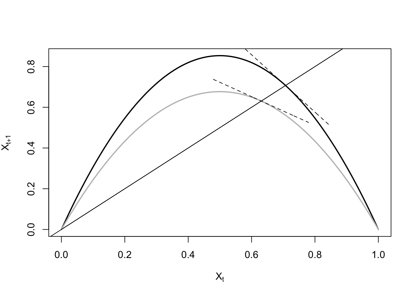
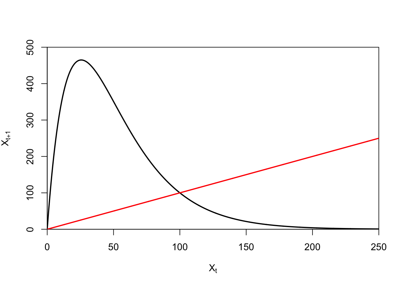
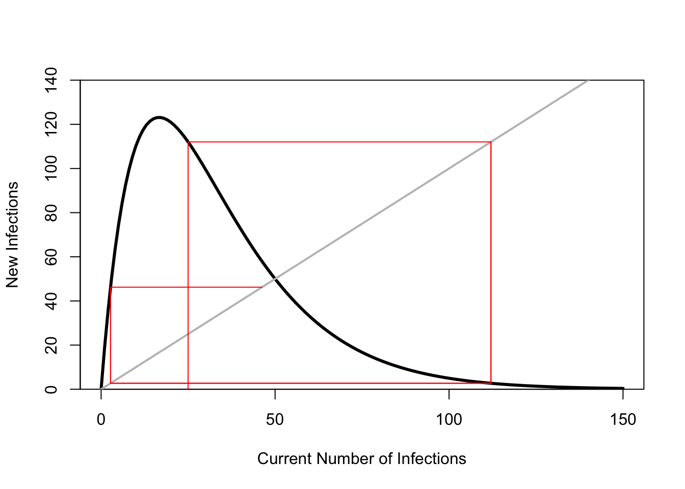
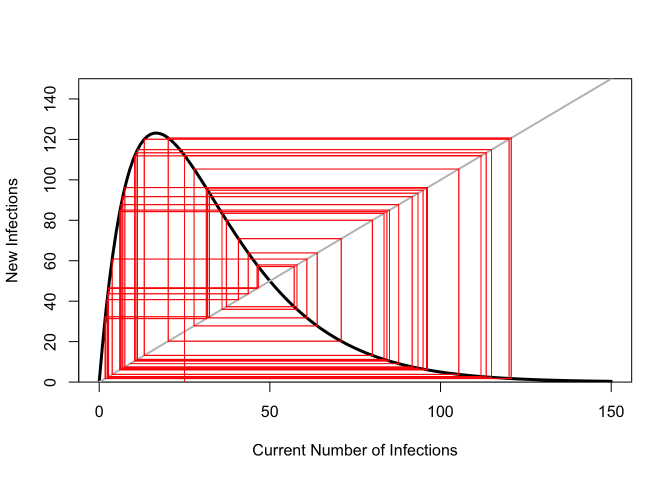
ricker.recruit <- function(r0,K,N) N*exp(r0*(1-(N/K)))
r0 <- 3
K <- 50
N <- 0:150
plot(N,ricker.recruit(r0=r0,K=K,N=N), type="l", col="black", lwd=3, yaxs="i",
     ylim=c(0,140),
     xlab="Current Number of Infections", ylab="New Infections")
abline(a=0,b=1, lwd=2, col=grey(0.75))


## cobweb -- give it a couple spins around

n0 <- 25
y <- ricker.recruit(r0=r0,K=K,N=n0)
segments(n0,0,n0,y, col="red") #vertical 1
segments(n0,y,y,y, col="red") # horizontal 1
y1 <- ricker.recruit(r0=r0,K=K,N=y)
segments(y,y,y,y1, col="red") #vertical 2
segments(y,y1,y1,y1, col="red") #horizontal 2
y2 <- ricker.recruit(r0=r0,K=K,N=y1)
segments(y1,y1,y1,y2, col="red") #vertical 3
segments(y1,y2,y2,y2, col="red") #horizontal 3
y3 <- ricker.recruit(r0=r0,K=K,N=y)
segments(y,y,y,y3, col="red") #vertical 4
segments(y,y3,y3,y3, col="red") #horizontal 4
y4 <- ricker.recruit(r0=r0,K=K,N=y1)
segments(y1,y1,y1,y4, col="red")

The cobwebbing shows how the Ricker recruitment function (when the growth rate is high) repeatedly overcompensates. When population density is low, it grows fast, exceeding the carrying capacity and subsequently crashing. This just keeps going, as we can see by letting the cobwebbing go for more iterations.

## another try, with a lot more spins
plot(N,ricker.recruit(r0=r0,K=K,N=N), type="l", col="black", lwd=3, yaxs="i",
     ylim=c(0,150),
     xlab="Current Number of Infections", ylab="New Infections")
abline(a=0,b=1, lwd=2, col=grey(0.75))
t=50
y <- rep(0,t)
y[1] <- ricker.recruit(r0=r0,K=K,N=n0)
for(i in 2:t)  y[i] <- ricker.recruit(r0=r0,K=K,N=y[i-1])

segments(n0,0,n0,y[1], col="red")
segments(n0,y[1],y[1],y[1], col="red")
for(i in 2:(t-2)){
    segments(y[i],y[i],y[i],y[i+1], col="red") #vertical
    segments(y[i],y[i+1],y[i+1],y[i+1], col="red") #horiz
    segments(y[i+1],y[i+1],y[i+1],y[i+2], col="red") #vert
    segments(y[i+1],y[i+2],y[i+2],y[i+2], col="red") #horiz
}

What does the Ricker time series look like?

## Ricker Time Series
x0 <- runif(1)
tmax <- 100
y <- rep(0,(tmax+1))
y[1] <- x0

for(t in 2:(tmax+1)) y[t] <- ricker(n=y[t-1],r=a,k=k)

plot(seq(0,tmax),y, type="l", xlab="Time", ylab="Population Size")

Functional response by predators combined with density-dependence of prety stabilizes the Lotka-Voltera model. They also check the growth rate of high-productivity species like rodents.

# Rosenzweig & MacArthur (1963) model
# Using Stevens' Primer
require(deSolve)
predpreyRM <- function(t, y, p) {
  H <- y[1]
  P <- y[2]
  with(as.list(p), {
   dH.dt <- b * H * (1 - alpha * H) - w * P * H/(D + H)
   dP.dt <- e * w * P * H/(D + H) - s * P
   return(list(c(dH.dt, dP.dt)))
  }) 
}

# Stevens: a = w/D = attack rate of LV (H -> 0)

b <- 0.8
e <- 0.07
s <- 0.2
w <- 5
D <- 400
alpha <- 0.001
H <- 0:(1/alpha)

Hiso <- expression(b/w * (D + (1 - alpha * D) * H - alpha * H^2))
HisoStable <- eval(Hiso)

p.RM <- c(b = b, alpha = alpha, e = e, s = s, w = w, D = D)
tmax <- 150
times <- seq(0,tmax,by=0.1)
RM1 <- as.data.frame(ode(c(900, 120), times, predpreyRM, p.RM))
colnames(RM1) <- c("time","prey","predator")

plot(RM1[,"time"], RM1[,"prey"], type="l", lwd=2, col="blue", xaxs="i",
     xlab="Time", ylab="Population Size",
     ylim=c(0,900))
lines(RM1[,"time"], RM1[,"predator"], col="orange", lwd=2)
legend("topright",c("Predator","Prey"), col=c("orange","blue"),lwd=2)

## phase portrait
plot(RM1[,"prey"], RM1[,"predator"], type="l", lwd=2, col="magenta", 
     xlab="Prey Population", ylab="Predator Population")

## Jacobian of LV
dhdt <- expression(b * H * (1 - alpha * H) - w * P * H/(D + H))
dpdt <- expression(e * w * P * H/(D + H) - s * P)

RMjac1 <- list(D(dhdt, "H"), D(dpdt, "H"), D(dhdt, "P"), D(dpdt, "P"))
H <- s * D/(e * w - s)
P <- eval(Hiso)
(RM.jac2 <- matrix(sapply(RMjac1, function(pd) eval(pd)), nrow = 2))
           [,1]      [,2]
[1,] -0.2133333 -2.857143
[2,]  0.0112000  0.000000
eigen(RM.jac2)[["values"]]
[1] -0.1066667+0.1436044i -0.1066667-0.1436044i
## plot functional response
# revert to this value of H:
holling2 <- expression(a * x/(1 + a*h*x))
x <- 0:100
a <- 0.2
h <- 0.25

plot(x,eval(holling2), type="l", col="purple", lwd=2, yaxs="i",
     xlab="Prey Population Size", ylab="Number of Prey Consumed", ylim=c(0,3.5))

Add predators and rodents stop cycling. Extirpate generalist predators (e.g., coyotes) and you get the potential for explosive (and erratic) rodent growth.

2.3 Metapopulations

2.4 Multi-Host Epidemics

Woolhouse et al. (1997) and Woolhouse et al. (2001): 80/20 rule

2.4.1 Multi-Host Epidemic Isoclines

Holt et al. (2003)

## Non-interacting
x <- seq(1,10,,500)
x1 <- seq(0,9,,100)

plot(x,x, type="n", axes=FALSE, frame=TRUE, xlab="Species 1", ylab="Species 2")
axis(1,at=c(7), labels=c(expression(hat(S)[1])))
axis(2,at=c(7), labels=c(expression(hat(S)[2])))
rect(par("usr")[1], par("usr")[3],
     par("usr")[2], par("usr")[4],
     col = grey(0.95))
rect(par("usr")[1], par("usr")[3],
     7, 7, col="white")
#polygon(c(x1,rev(x1)), c(x1,rev(x1)), col="green", border=FALSE)
segments(0,7,7,7, lwd=3, col="red")
segments(7,0,7,7, lwd=3, col="red")
text(5,5, expression(R[0]<1))
text(8,8, expression(R[0]>1))

## Weakly Interactions
## This one is tricky to get the polygon on, so invert:
## draw the polygon under and make that white on top of a 
## background rectangle the dimensions of the plot that is grey

g <- seq(0,sqrt(1/5),length=100)
h <- sqrt(1-(5*g^2))
plot(g,h, type="n", 
     axes=FALSE, frame=TRUE, 
     yaxs="i", xaxs="i", 
     ylim=c(0,1.1), xlim=c(0,0.5),  
     xlab="Spcies 1", ylab="Species 2")
rect(par("usr")[1], par("usr")[3],
     par("usr")[2], par("usr")[4],
     col = grey(0.95))
polygon(c(g[1],g),c(0,h),col="white", border=FALSE)
lines(g,h,col="red", lwd=3)
axis(1,at=c(0.4485), labels=c(expression(hat(S)[1])))
axis(2,at=c(1), labels=c(expression(hat(S)[2])))
text(0.37, 0.8, expression(R[0]>1))
text(0.23,0.63, expression(R[0]<1))

## Substitutable

m <- (0.8432192-0.1235539)/(1.230762-8.257112)
b <- 0.8432192-(-m*1.230762)
xint <- -b/m

plot(x, 1/x, type="n", lwd=3, col="red", xlim=c(1.5,9), ylim=c(0.15,1/1.2), axes=FALSE,
     xlab="Species 1", ylab="Species 2")
box()
polygon(c(seq(1,10,length=100), seq(10,1,length=90)), c(m*seq(1,8.257112,length=100)+1.2*b, rep(8.257112,90)),
        col=grey(0.95), border="red", lwd=3)
#segments(1.230762,0.8432192,8.257112,0.1235539, lwd=3, col="red")
axis(1,at=c(8.7), labels=c(expression(hat(S)[1])))
axis(2,at=c(0.7423), labels=c(expression(hat(S)[2])))
text(6.5, 0.56, expression(R[0]>1))
text(3,0.3, expression(R[0]<1))

## Complementary

plot(x, 1/x, type="l", lwd=3, col="red", xlim=c(1.5,9), ylim=c(0.15,1/1.2), axes=FALSE,
     xlab="Species 1", ylab="Species 2")
box()
polygon(c(seq(1,10,by=0.1), seq(9,1,by=-0.1)), c(1/seq(1,10,by=0.1), rep(10,81)), col=grey(0.95), border="red")
axis(1,at=c(8.12), labels=c(expression(hat(S)[1])))
axis(2,at=c(0.8325), labels=c(expression(hat(S)[2])))
text( 5, 0.32, expression(R[0]>1))
text(2.5, 0.24, expression(R[0]<1))

## Alternating
x <- seq(0,10,,100)
y <- 2/x

plot(x,y,type="n", axes=FALSE, frame=TRUE, xlab="Species 1",
     ylab="Species 2", xlim=c(0,7), ylim=c(0,7))
polygon(c(x,rev(x)), c(y,rep(8,100)), col=grey(0.95))
lines(x,y, lwd=3, col="red")
text(0.65, 0.61, expression(R[0]<1))
text(2.7, 2.1, expression(R[0]>1))

## Inhibitory

x <- seq(1,15,,100)
y <- -15 + 2*x

x1 <- seq(8,15,,100)
y1 <- -15 + 2*x1

plot(1:15,1:15,type="n", xaxs="i", yaxs="i",
     axes=FALSE, frame=TRUE, xlab="Species 1", ylab="Species 2")
axis(1,at=c(8), labels=c(expression(hat(S)[1])))
#polygon(c(8,8:15, col=grey(0.95)))
polygon(c(x1[1],x1,x1[100]), c(1,y1,1), col=grey(0.95), border=FALSE)
text(12,4.2, expression(R[0]>1))
text(7.5, 5.2, expression(R[0]<1))
lines(x,y, lwd=3, col="red")

2.5 The Two Big Ideas in Disease Ecology

2.5.1 The Dilution Effect

The relationship between biodiversity and disease risk is probably the fundamental debate in disease ecology.

Dilution and Lyme, the model: - Forest destruction and fragmentation leads to reduced species diversity - White-footed mice capitalize and tend to increase in density in disturbed habitats - Increased mouse density leads to increased human exposure - Allan et al. (2003): Nymphal infection prevalence declined linearly with increasing fragment size - Exponential decline in nymphal density with increasing patch size - Note that all of these papers from the Ecosystem Studies folks (Ostfeld, Keesing, LoGuidice, et al.) use prevalence as their measure of risk - Using this measure hides a big assumption - This assumption is that there is a trade-off between the presence of one species (e.g., white-footed mice) and another (e.g., chipmunks) - If the host population size is not approximately constant, prevalence is not an appropriate measure of risk! - There is a desperate need to count ticks!

Randolph and Dobson (2012) note that (perhaps obviously) ticks are not mosquitoes. Mosquito density is determined in host-independent ways, while tick density is determined in host-dependent ways (because they are parasitic at all life-cycle stages). They write, “Examination of the theoretical and empirical evidence for this hypothesis reveals that it applies only in certain circumstances even amongst tick-borne diseases, and even less often if considering the correct metric—abundance rather than prevalence of infected vectors. Whether dilution or amplification occurs depends more on specific community composition than on biodiversity per se.”

2.5.2 The Resource-Pulse Hypothesis

Sometimes called “Trophic Cascade” (e.g., in Yates et al. 2002). This is problematic, as noted by Stapp (2007) since a trophic cascade is a top-down process and the mechanism described, e.g., by Yates et al. (2002) is bottom-up. The idea of a trophic cascade is attributable to Hairston et al. (1960) and is sometimes known as the green-world hypothesis. Remove predators and grasslands will be over-grazed. As Stapp notes, what Yates and colleagues (and various disease ecologists who followed) describe is actually a trophic amplification.

For example, Yates et al. (2002) attribute the emergence of the paradoxically-named Sin Nombre Hantavirus in the desert Southwesst of the US in 1993 to what they call a “trophic cascade”: “Evidence from two El Niño episodes in the American Southwest suggests that El Niño–driven precipitation, the initial catalyst of a trophic cascade that results in a delayed density-dependent rodent response, is sufficient to predict heightened risk for human contraction of hantavirus pulmonary syndrome.”