I will be teaching my class, Earth System Science 185: Adaptation, again this winter quarter. One of the stated learning outcomes for this class is to be able to “interpret complex scientific figures.” I show the class lots of figures and ask them in all of the problem sets and both exams to interpret scientific figures. These figures are usually theoretical, though they sometimes involve data. This is largely a theory class though, so lots of theoretical ecology, evolution, and complex systems.
To supplement lecture this year, I have assembled some notes on interpreting and rendering scientific figures. These notes are highly incomplete, but they represent a pretty good start. I have learned some hard-won tricks for making attractive and clear scientific figures in R and it seemed like a good idea to assemble them in one place. You can find these notes (which I hope to update as the quarter proceeds) here.
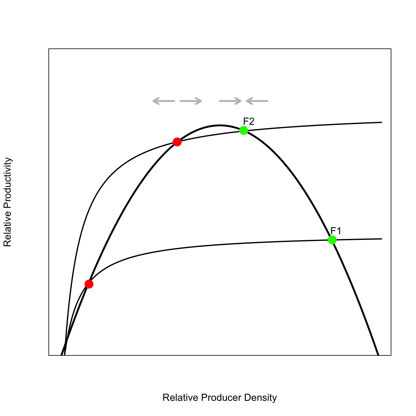
An example of the sort of scientific figure we work with is the Noy-Meir (1975) model for stability of grazing systems. The following figure represents the core idea of Noy-Meir’s model.
The primary producers have a logistic recruitment curve, while grazers follow a Holling Type II functional response. Points where these curves intersect represent equilibria of the system. The green points are stable, whereas the red points are unstable (stability indicated by the grey arrows above the curves). The two consumption curves represent potential slow-forcing of the system from population growth of the consumer. Population growth can easily lead to the loss of the stable equilibria of the system, leading to catastrophic collapse.
To be honest, I’m not sure if these notes will ever move beyond class notes. So far, I have four chapters:
interpreting scientific figures
drawing a rogues’ gallery of classic figures from theoretical ecology, behavioral ecology, economics, and complexity theory
“actual graphs” (i.e., networks)
numerically integrating (and plotting!) ODEs
These are my various non-standard uses for R graphics (i.e., as opposed to actually plotting data!).