I’ve been working on a number of projects that aren’t super-data-intensive recently. Whenever this happens, I like to keep my data-visualization skills sharp by recreating plots I come across in the literature, social media, and the news. I also have a policy that if I’m going to show a plot in one of my classes, I have a strong preference for using a visualization I have made. This goes for both theoretical and empirical figures.
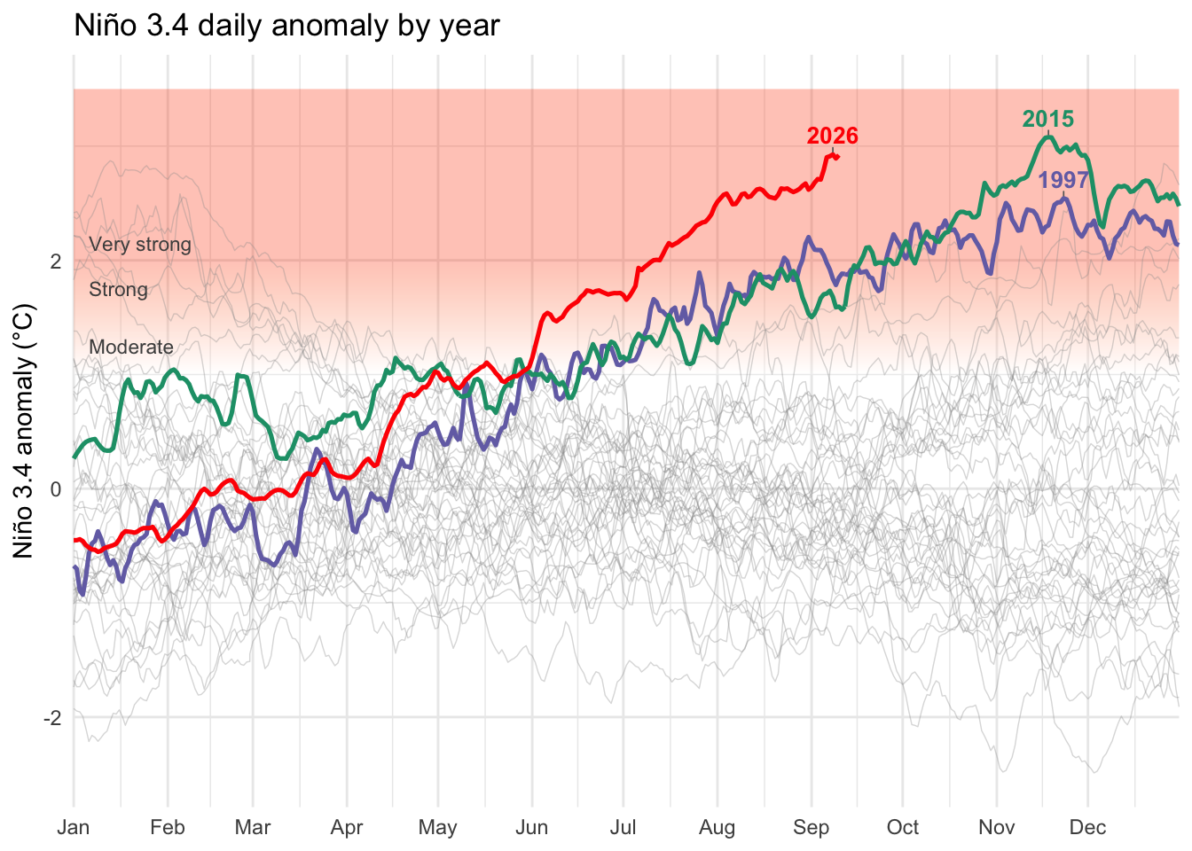
Climate scientist Zeke Hausfather recently shared a striking plot on Bluesky and LinkedIn of time series of the Niño 3.4 anomalies. I’ve been meaning to update some of my plots related to El Niño, and this gave me the push I needed.
His plot is beautiful, but the implications are rather unsettling. As of two days ago, the Niño 3.4 index was 2.9, which is the seventeenth largest value in the entire record (16,324 observations). The sixteen values that are greater than this are all around the peak of previous maximum, which occurred in November of 2015. Mid-late November is when we typically see maximum values, as you can see from both the 1997 and 2015 series, and we’re still two full months away from that! Conditions are certainly pointing toward one hell of an El Niño in the works. 2015 was one of the strongest events on record and the current conditions are already as anomalous as that year, just two months before the typical maximum.
Niño 3.4 is an index based on sea-surface temperature (SST) differences used to monitor the El Niño–Southern Oscillation (ENSO). ENSO is the coupled ocean–atmosphere climate pattern in the tropical Pacific that has profound and varied influences on global weather patterns. Niño 3.4 is defined as the sea surface temperature anomaly averaged over an equatorial box spanning roughly from the international date line to just west of the South American coast (5°S–5°N and 170°W–120°W). Along with the Oceanic Niño Index (ONI), the Niño 3.4 index is the most commonly used index to define El Niño and La Niña events. You can find more information at the NCAR Climate Data Guide.
Data come from the Climate Dashboard. As noted in the data file’s header, the data includes the anomalies and every day-of-year from 1982 to 10 September 2026. As is important with SST measures in a warming world, the warming trend is removed so that years “compare as ENSO states.”
Like most climate scientists, Hausfather assumes people will use Python, as indicated by his note in the header, “Load with pandas.read_csv(…, comment=‘#’).” Indeed, the Climate Dashboard includes Python code for creating this plot (and various others). I’m trying to recreate something comparable here in R without looking at his existing code. It might be interesting to use Claude, e.g., to do a more direct translation, but that’s a task for another weekend. Maybe this post will be helpful to R users who want to engage more with climate data.
This plot is a canonical tidyverse/ggplot case and—I have to come clean on this—I’m not tidyverse expert. My data-scientist daughter gives me a hard time about this on a regular basis. I actually have a whole set of notes on making scientific figures using base R. Base R is clearly the better tool for making theoretical scientific figures, but data-intensive tasks like this are what the tidyverse tools were designed for. So, here’s my best effort (so far). It’s mostly there.
One interesting new tool I used here is the ggrepel library for labeling specific series. ggrepel allows you to place label geoms at data-driven anchor points such as a line’s last point or its peak. It then nudges the label to look pretty. So far, this tool seems to work extremely well. It (somewhat) replaces the base R functionality of locator() in the ggplot environment.
Other than that, everything is pretty standard: read in the data, mutate to a useful form, make the plot. I create a dummy year that each year is plotted against using an arbitrary origin = "2001-01-01". This helps with having the x-axis labels be month names. I guess the one other thing is that I added a raster to indicate ENSO intensity. That was another new one for me.
library(tidyverse)library(ggrepel)## assumes the file is in your working directorynino <-read_csv("nino_daily_years_nino34.csv",comment ="#")nino <- nino %>%mutate(# map day_of_year onto a dummy (non-leap) year just for axis labelingplot_date =as.Date(day_of_year -1, origin ="2001-01-01"),year =factor(year) )highlight_years <-c("2026", "2015", "1997")highlight_colors <-c("2026"="red", "2015"="#1b9e77", "1997"="#7570b3")background <- nino %>%filter(!year %in% highlight_years)foreground <- nino %>%filter(year %in% highlight_years)x_range <-range(nino$plot_date)month_starts <-seq(as.Date("2001-01-01"), as.Date("2001-12-01"), by ="1 month")# --- fixed y-ceiling: gives headroom above the data max for labels ---y_ceiling <-3.5y_floor <-min(nino$anomaly_c, na.rm =TRUE)# --- ENSO intensity raster ---n_steps <-500y_seq <-seq(y_ceiling, 1, length.out = n_steps)intensity <-pmin((y_seq -1) / (2-1), 1)band_colors <-colorRampPalette(c("white", "orangered"))(101)[round(intensity *100) +1]band_colors <- scales::alpha(band_colors, 0.30)band_raster <-matrix(band_colors, ncol =1)peak_labels <- foreground %>%group_by(year) %>%slice_max(anomaly_c, n =1, with_ties =FALSE) %>%ungroup()p <-ggplot() +annotation_raster( band_raster,xmin = x_range[1], xmax = x_range[2], ymin =1, ymax = y_ceiling,interpolate =TRUE ) +geom_line(data = background,aes(x = plot_date, y = anomaly_c, group = year),color ="grey60", alpha =0.35, linewidth =0.25 ) +geom_line(data = foreground,aes(x = plot_date, y = anomaly_c, group = year, color = year),linewidth =0.9 ) +geom_text_repel(data = peak_labels,aes(x = plot_date, y = anomaly_c, label = year, color = year),fontface ="bold", size =3.5, show.legend =FALSE,nudge_y =0.15, segment.color ="grey40", segment.size =0.3,min.segment.length =0 ) +annotate("text", x = x_range[1] +5, y =1.25,label ="Moderate", hjust =0, size =3, color ="grey30") +annotate("text", x = x_range[1] +5, y =1.75,label ="Strong", hjust =0, size =3, color ="grey30") +annotate("text", x = x_range[1] +5, y =2.15,label ="Very strong", hjust =0, size =3, color ="grey30") +scale_color_manual(values = highlight_colors, guide ="none") +scale_x_date(breaks = month_starts, labels = month.abb,limits = x_range, expand =c(0, 0)) +coord_cartesian(ylim =c(y_floor, y_ceiling), clip ="off") +labs(x =NULL,y ="Niño 3.4 anomaly (°C)",title ="Niño 3.4 daily anomaly by year",subtitle ="2026 vs. the two other most anomalous El Niño years (1997, 2015)" ) +theme_minimal()## decided I didn't want the subtitle after all...p +labs(subtitle =NULL) +theme(plot.title =element_text(margin =margin(b =5.5))) # default is larger; try 5.5-10